Bedroom Reveal!
This weekend we finally finished the bedroom renovation!!
We started this project last year, but with the holidays and
the extra plaster work that was required, it all took a bit longer to complete. The first post was here This is a long post, so please indulge me!
So let’s revisit: the
brief was to create a bedroom that was beautiful but at the same time plain and
simple. No frills, no vintage frippery,
no bold patterns, no bright colours.
Muted and considered was key to a happy client and keeping costs within budget was crucial.
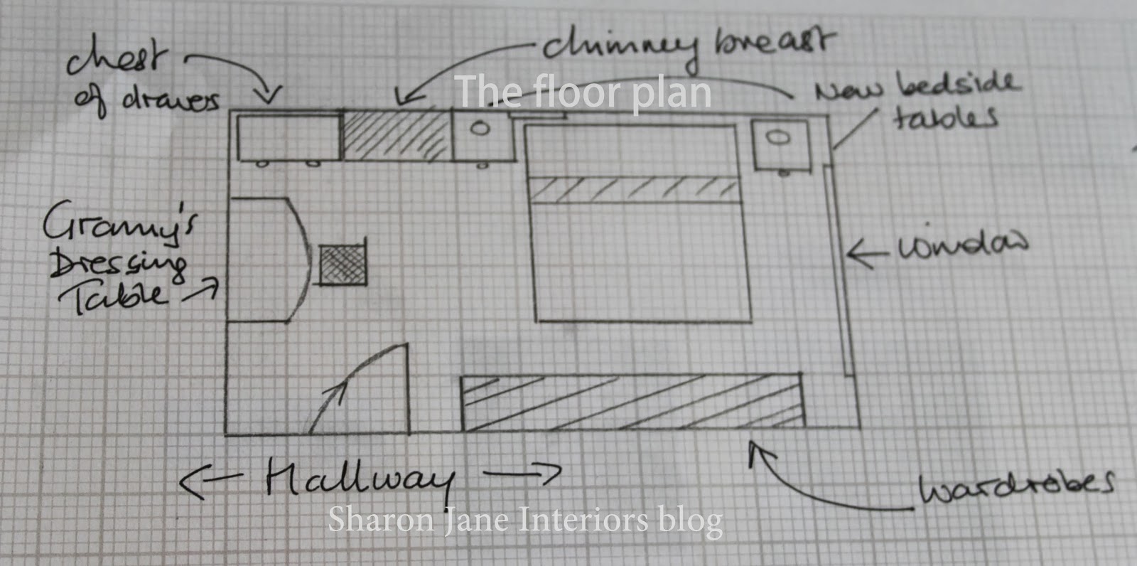
The first thing I did was reconfigure the layout of the room to create more space by doing a quick sketch by hand.
My idea was to create a colour palette that
echoed the colours of the seaside but wasn't in any way nautical in look, with the Duck Egg blue paint colour as a starting point.
My final moodboard that was presented to client was this:
Let's remember what the room looked like:
My final moodboard that was presented to client was this:
Let's remember what the room looked like:
So you'll remember that I said the first thing to go was the navy carpet. Underneath it revealed the most beautiful
wooden floors, which immediately give character to any room. They were given a light sanding and a couple
of layers of wax to seal them. The wax
allows the natural grain of the wood to show through without any yellowing.
As client has an aversion to anything second hand, we decided to upcycle the existing pieces of furniture rather than buy
new ones. All the disparate pieces of
wooden furniture were made cohesive by painting them all in the same paint
colour. The only piece of
furniture which didn't get a makeover was my client’s late grandmother’s
dressing table and chair. We left this
as is, at the request of the client.
Custom blinds above the bed and large window allow for additional privacy and this creates a really casual feel which is what I was hoping to achieve.
Working within the small budget was crucial, so instead of
having a new headboard made up, we decided to make a cover in a canvas cream
fabric which just slipped over the existing headboard very much like a tea
cosy.
I knew I couldn't bring in any large florals or bright colours, so I went with subtle stripes, a check and a subtle floral on cushion covers to add texture and interest which complemented the restful feel to the bedroom and with the addition of a striped throw at the bottom of the bed, really upped the cosiness factor.
A new pendant light was chosen for its beautiful shape and its texture and the pretty shadows it casts when lit at night and we went
for plain white pleated bedside table lamps. You can see the chest of drawers isn't correctly positioned in the middle of the alcove - a small area on the chimney breast had damp issues which has just been painted, so once this is dry the chest will be moved over a bit and the mirror can be hung, so for the moment it's just propped up!
There is always a risk of overdoing a design, everything looking a bit too contrived but this room is bright and airy and the colour has really lifted the room out of the mundane and now feels cosy and calm but cheerful at the same time. The walls are a bit bare at the moment, client has a few framed family photos to hang up but I think it's got a great feel as it is and doesn't need too many pieces on the walls.
There is always a risk of overdoing a design, everything looking a bit too contrived but this room is bright and airy and the colour has really lifted the room out of the mundane and now feels cosy and calm but cheerful at the same time. The walls are a bit bare at the moment, client has a few framed family photos to hang up but I think it's got a great feel as it is and doesn't need too many pieces on the walls.
I wanted to add in a pop of colour but instead of going with
a traditional blue rug which would make the room look more formal, I added a
yellow rug from Ikea, which brings a fun element into the room and draws the
eye down to the beautiful waxed floor boards.
We continued with the yellow by adding a cushion on the chair.
The look is restrained yet inviting, elegant but still
informal. No stuffiness or over
accessorising. I think we met client’s
brief of beautiful but plain and simple….what
do you think?
(all photos are copyright SharonJaneInteriors - please do not use without permission)
Take care and have a great week!
Sharon
xxx


That's adorable! How gorgeous is that! Elinor x
ReplyDeleteThanks Elinor, glad you like it!
DeleteWhat a transformation Sharon, it looks like another room, and it's so pretty.
ReplyDeleteI've been wanting to do a renovation in my bedroom, too but so far I could not figure out how to rearrange the furniture in a nicer way.
Congratulations, the room looks beautiful
Hi Regina! It is quite a dramatic change and the client is very happy! I am too! Hugsx
DeleteYour client must be so pleased with the end result! I think it is lovely. I did an interior design course once and remember doing floor plans and mood borders. It was nice to see that you recycledsome items and the grandmothers dressing table look stunning against the beautifully painted walls. I like the different patterns of the cushions too. A great job! Sarah x
ReplyDeleteThanks Sarah, I'm glad it all came together as I envisioned it and the client is happy. I love the restful colours, it's not too busy and exactly what the client wanted. xx
Delete“Custom blinds above the bed and large window allow for additional privacy and this creates a really casual feel which is what I was hoping to achieve.” – I agree. It’s important to consider your privacy without excluding yourself to your beautiful surroundings. Shutters can help you adjust the amount of sunlight that enters your home. It also hides you from the outsider’s eyes. You just have to find quality window treatments for your beloved home. :)
ReplyDeleteGreg Arnett
Sharon, gostei muitíssimo do resultado final, o quarto ficou lindo, aconchegante e ao mesmo tempo alegre...linda cartela de cores e estampas! Parabéns, amiga!
ReplyDeleteBjos.
Sílvia
Thank you Silvia, glad you like the colours and the fabric choices I had great fun doing it all! Sharon x
DeleteOLÁ,
ReplyDeleteQUE LINDO SEU QUARTO, ADOREI A COR, MUITO BONITO. E A ROUPA DE CAMA BELÍSSIMA.
TENHA UM ÓTIMO DIA.